
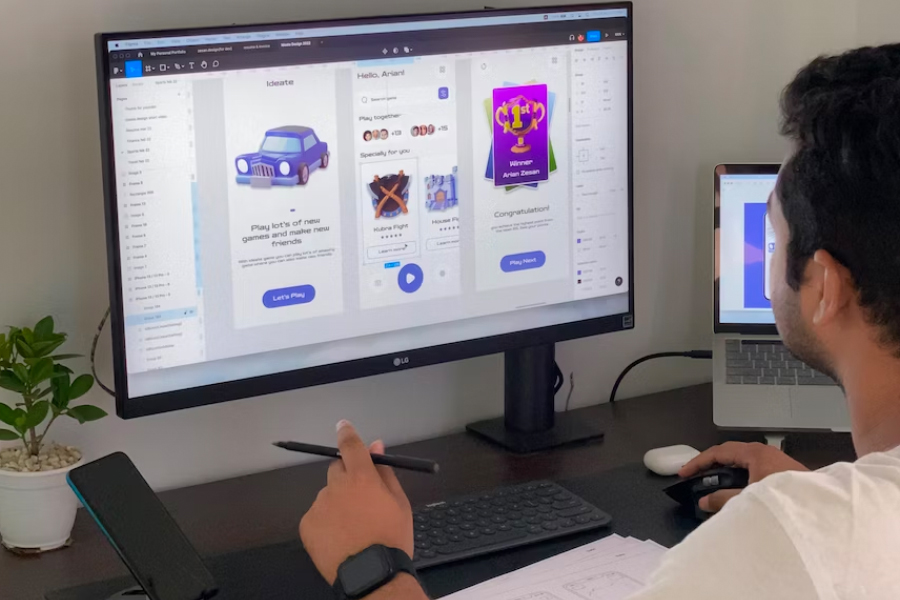
Creating interfaces that captivate users at first glance is a challenging task. The secret to building a truly powerful user experience lies in a unique combination of creative flair and strategic insight. A great deal of psychological analysis is put into practice by UX UI design agencies when implementing a design idea, and visual hierarchy stands at the foundation of it.
What is a visual hierarchy in UI/UX design?
Visual hierarchy refers to putting elements in order of priority and importance. It can be thought of as the initial strategy that a designer lays out before placing elements in their places. Quite naturally, the most important elements need to attract the user’s attention quickly so that the product can achieve its purpose. For instance, if an app development service develops a shopping app, they’ll have to prioritize the USPs so that users can always see them. Users are more likely to buy products if they see the products frequently.
Importance of Visual hierarchy in UX/UI design
A user merely takes a few seconds to look at a website, and the decision to stay or leave is based on the web page’s purposefulness. However, no matter how important the information a website may have, if the data can’t reach the user quickly and effectively, its effect is the same as the information being absent completely. By prioritizing certain elements over others and strategically arranging them, designers at any UI UX designing company can create a more intuitive and streamlined user experience. This approach reduces friction, making it easier for users to interact with a product and ultimately improving their satisfaction and engagement.
Visual hierarchy entails certain key principles that designers need to keep in mind.
1. Size and scale are the key components that shape a user’s perspective.
The important elements typically are bigger or scale – be it a text or image. While enlarging some elements can help catch a user’s attention towards it, keeping its size too big or keeping other, less important elements at a similar size can abolish the intended effect the designer is trying to achieve.
2. Contrast and color:
Understanding color psychology is crucial to deciding what color to give to the elements in your product. Brighter colors with high contrast, when placed against the background, are typically used to grab the user’s attention. A good example of this is any website’s call to action buttons. Keeping their color brighter is more likely to result in a viewer converting into a customer.
3. Whitespace:
While designing, keeping space free of elements is just as important as adding elements to your canvas. Important details that need more user attention are usually placed in isolation from other redundant components. Cluttering the space with too many elements can result in a user bouncing off the product’s page without seeing the core product displayed.
To conclude, at the heart of UX design lies the idea of optimizing usability and minimizing obstacles for the user. A major strategy for achieving this is by implementing an effective visual hierarchy. The art of visual hierarchy is all about putting the right pieces in order so users can effortlessly find what they need. Key principles such as size, scale, contrast, color, and whitespace are crucial to determining and achieving effective visual hierarchy. With the right combination of creativity and strategy, designers can optimize usability and improve navigation for users, ensuring they have a positive experience with the product.


